Mendoza Immigration
Helping US immigrants fill out their legal immigration documents.
Streamlining the Immigration Process
What I Did
User Research
UX/UI Design
Visual Identity
Prototype & Testing
Concept Project
Overview
To hone my UX/UI design skills, I sought out projects needing improvement. Developer friends introduced me to a platform by a law firm that assists US immigrants with filling out legal immigration documents. Although the concept was excellent, the platform had several pain points that needed addressing. I worked to create a user-friendly platform that simplifies and guides users through the paperwork process more intuitively.
Opportunity
Mendoza Immigration Law firm identified that US immigrants struggled with understanding and filling out legal immigration documents. They developed a platform to assist users in completing these documents using less technical language, aiming to reduce the need for a lawyer's help.
-
Problem
The existing platform is confusing and overwhelming, leading to difficulties for users in completing the necessary paperwork.
-
Goal
Redesign the platform to be user-friendly, simplifying and guiding users through the document-filling process more intuitively.
Research
Understanding User Needs
I researched the DACA renewal immigration process to understand better the requirements and qualifications for legal residency in the US. This helped me define the target audience and their specific needs in the document-filling process. Additionally, I tested the platform with a few users, to observe their interactions and pinpoint pain points.
Target
A Look at the Target Users
The target audience for this platform is immigrants between the ages of 15 and 30 who arrived in the US before they turned 16, as per DACA eligibility criteria. This group is generally tech-savvy, resourceful, and goal-oriented. They come from diverse backgrounds, are often bilingual or multilingual, and rely on community support. Their adaptability and motivation to achieve legal status and career goals make them ideal users for a streamlined, user-friendly platform.
Pain Points
User Frustrations
Navigation Issues
1.
Users struggled to find and navigate the platform due to unclear website design.
Information Overload
2.
Users felt overwhelmed by the excessive amount of information presented.
Progress Uncertainty
3.
The length and steps of the process were unclear, causing frustration.
Design Solutions
Elevating Brand Perception
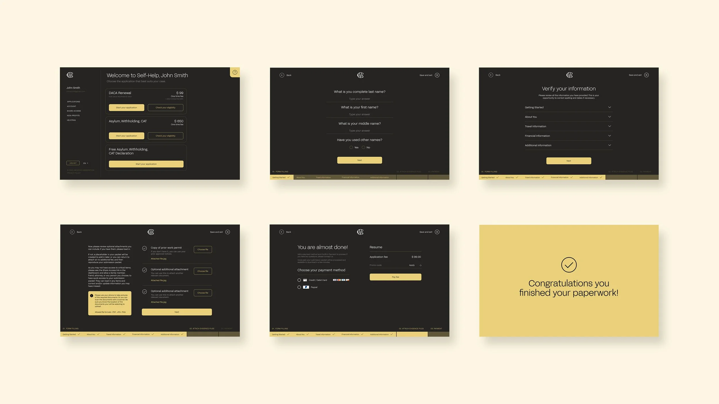
I modernized the UI design to make it more contemporary and approachable while retaining the law firm's professionalism. This involved updating the color scheme and typography to be more welcoming.
Making Access Easy
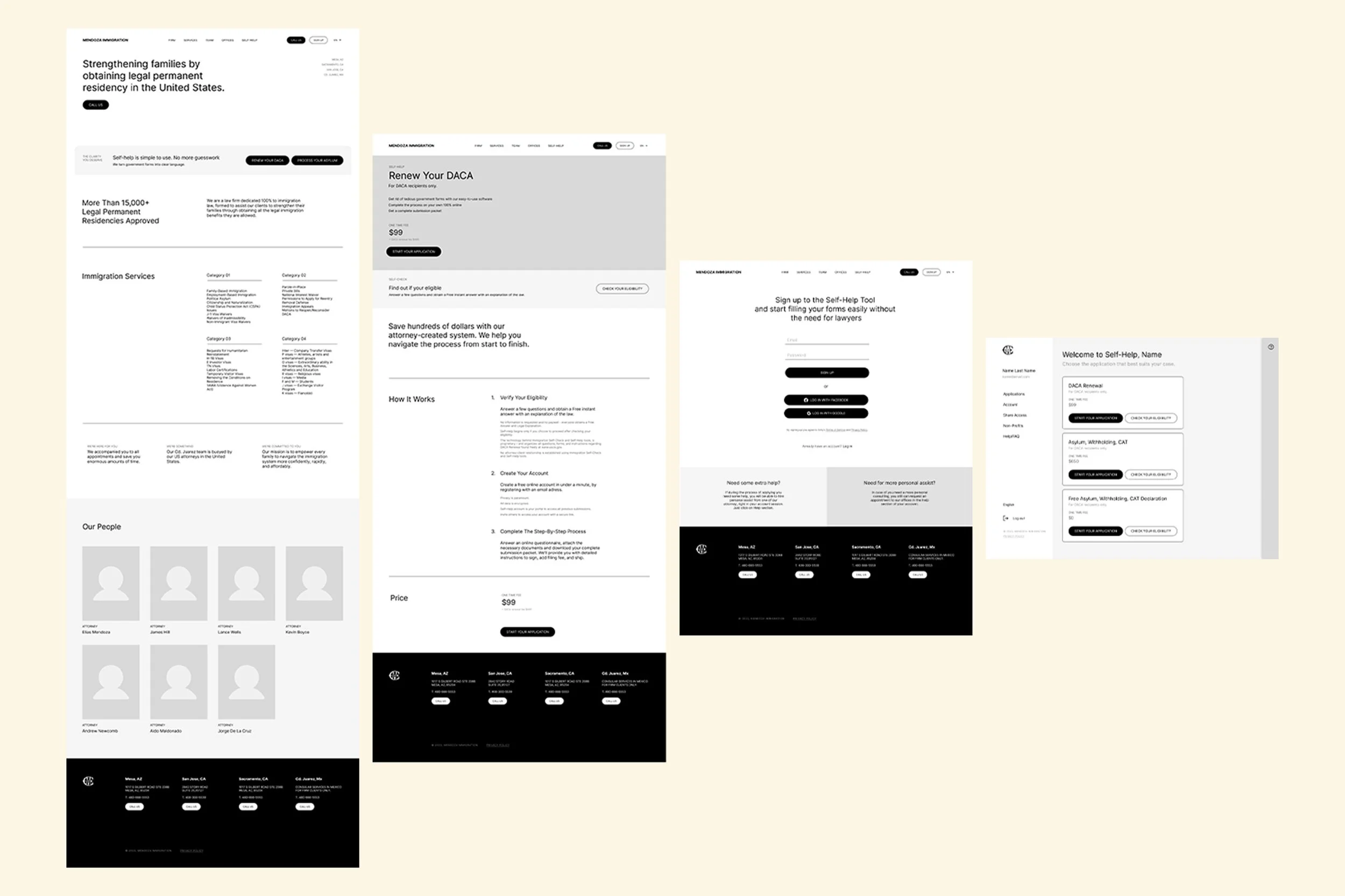
Since the platform is accessed from the main law firm website, I highlighted this service by adding a sticky bar at the bottom of the screen, making it easily accessible from any page on the website.
Simplifying Information for Users
I streamlined the information by removing unnecessary content, organizing the remaining information into a clear hierarchy, and breaking it down into manageable steps. Gradual information reveal helped prevent users from feeling overwhelmed.
Engaging Forms
To reduce the overwhelming feeling of the process, I opted for a wizard questionnaire approach. This approach breaks the form into sections, displaying one question or a small group of questions at a time. To make the process more engaging and rewarding, I incorporated micro-interactions such as a progress bar that fills up as the user advances and a checkmark animation to indicate when a section is completed.
Conclusion
Through these design improvements, the Mendoza Immigration platform became more user-friendly, intuitive, and engaging, ultimately helping users complete their legal documentation with greater ease and confidence.


