Saint Michel
A little piece of France in Mexico.
Saint Michel is a new pastry experience that, unlike traditional pastry shops, offers a specialty in individual cakes, providing a different experience for the user allowing them to be a great host offering variety for their guests.
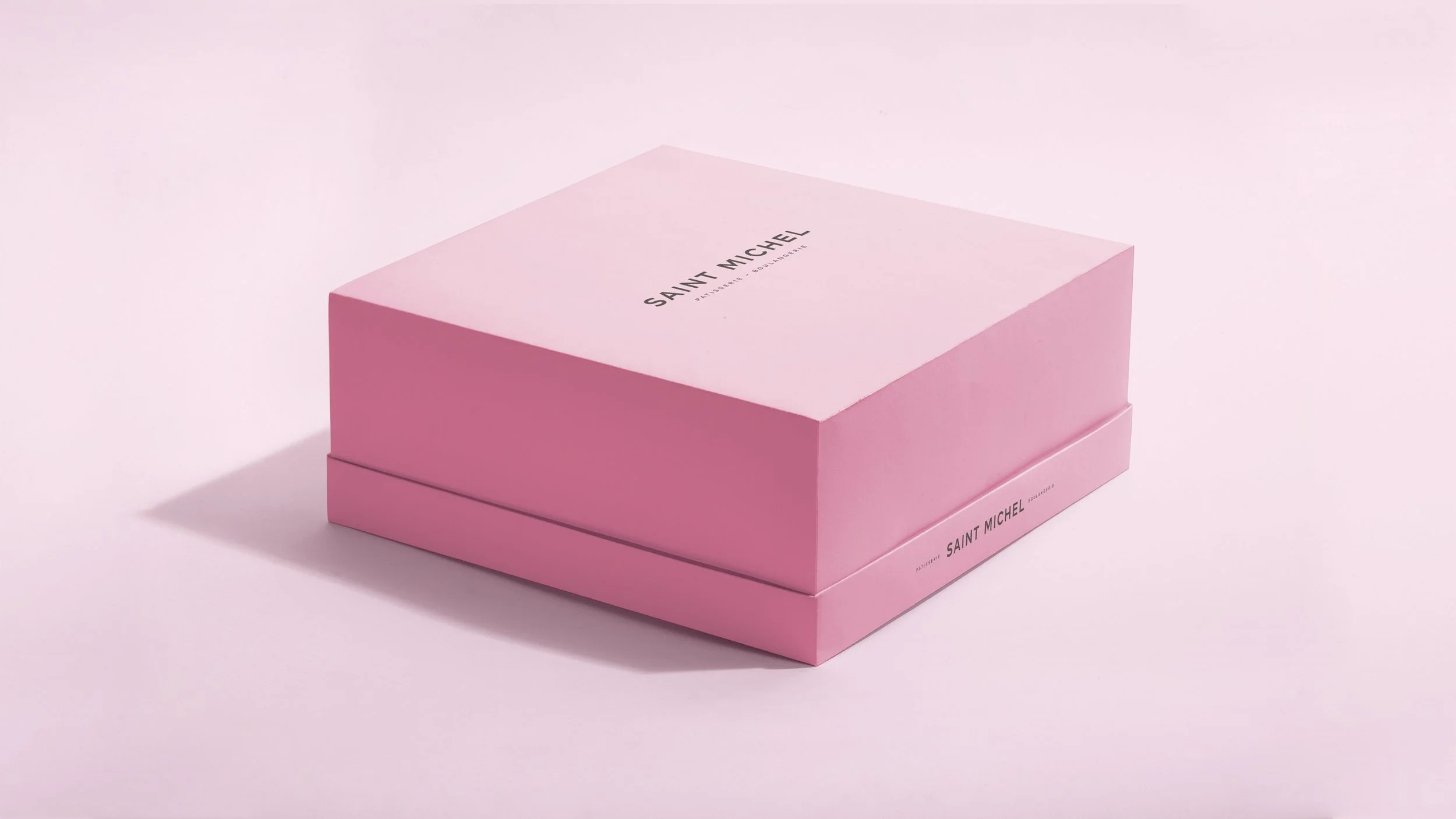
Under this premise, we found that packaging had to be a crucial communication tool, acting as the first presentation of the brand, highlighting the individuality of each of its cakes and inviting you to make "the combination" of cakes that you want. This modular packaging system allows to solve practically and economically the different possibilities that the consumer has.
In the branding, we wanted to reflect the essence of the brand (A little piece of France in Mexico) through the colors, which represent the diversity of its flavors due to the variety of its individual cakes and the savoir-faire in the assembly of each of its desserts through the voice of the brand.
In Saint Michel the product is the protagonist and its diversity generates a dynamism in its communication, in which we capture the emotion of perceiving its colors, flavors, and unique experience.
What I Did
Visual Identity, Packaging Design, Art Direction, Communication
Project designed at Comité Central


